This page demonstrates the available module styles and positions available in this template.
Click the following url here to see live demonstration.
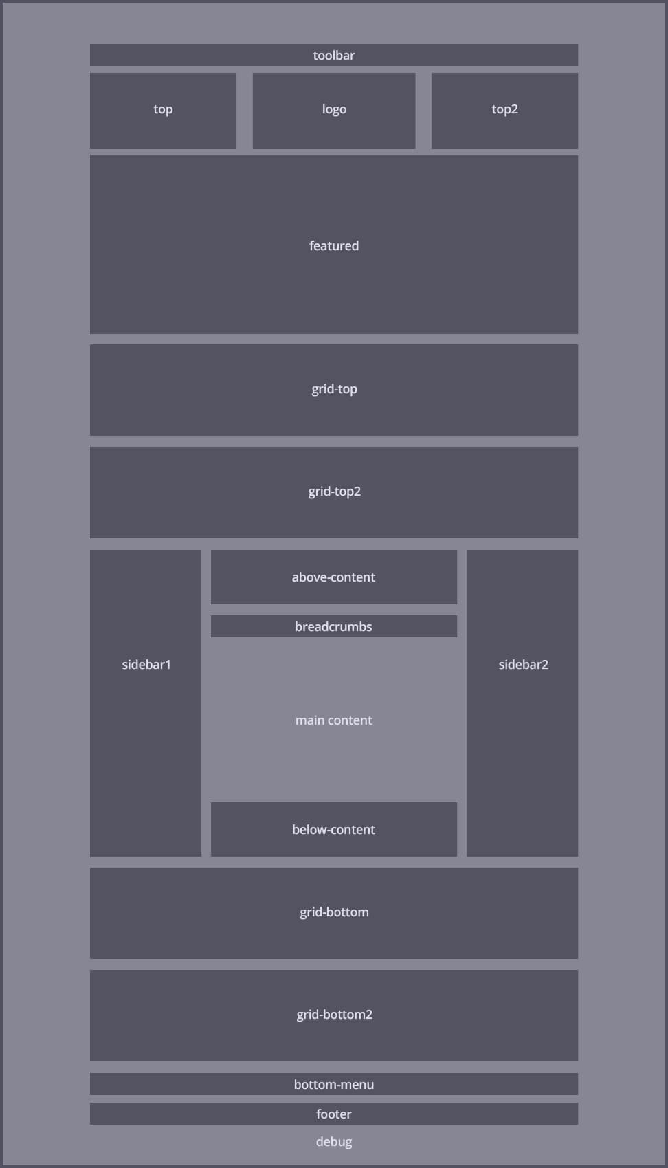
Click on the following image to know ABC's module map in detail.
This module is displayed in the grid-top position inside a "flex-grid". This module position will adapt up to 6 modules in a dynamic flexible row. The "flex-grid" can also be styled using any of the available styles.
You can add the class padding to add spacing around.
This module is displayed in the grid-top position inside a "flex-grid". This module position will adapt up to 6 modules in a dynamic flexible row. The "flex-grid" can also be styled using any of the available styles.
You can add the class padding to add spacing around.
This module is displayed in the grid-top2 position using the _ms2 module style with red color.
Suffix used: _ms2 red
This module is displayed in the grid-top2 position using the _ms2 module style with blue color.
Suffix used: _ms2 blue
This module is displayed in the grid-top2 position using the _ms2 module style with green color.
Suffix used: _ms2 green
This module is displayed in the grid-top2 position using the _ms2 module style with yellow color.
Suffix used: _ms2 yellow
This page demonstrates the available module styles and positions available in this template.
Click the following url here to see live demonstration.
Click on the following image to know ABC's module map in detail.
This module is displayed in the below-content position.
Suffix used: _ms3 green
This module is displayed in the grid-bottom position inside a "flex-grid". This module position will adapt up to 6 modules in a dynamic flexible row. The "flex-grid" can also be styled using any of the available styles.
Suffix used: _ms3 green
This module is displayed in the grid-bottom position inside a "flex-grid". This module position will adapt up to 6 modules in a dynamic flexible row. The "flex-grid" can also be styled using any of the available styles.
Suffix used: _ms3 red
This module is displayed in the grid-bottom position inside a "flex-grid". This module position will adapt up to 6 modules in a dynamic flexible row. The "flex-grid" can also be styled using any of the available styles.
Suffix used: _ms3 blue
This module is displayed in the grid-bottom2 position inside a "flex-grid". This module position will adapt up to 6 modules in a dynamic flexible row. The "flex-grid" can also be styled using any of the available styles.
This module will not be seen by phones as it has the hidden-phone module class suffix.
Suffix used:
This module is displayed in the grid-bottom2 position inside a "flex-grid". This module position will adapt up to 6 modules in a dynamic flexible row. The "flex-grid" can also be styled using any of the available styles.
Suffix used: _ms1 red
This module is displayed in the grid-bottom2 position inside a "flex-grid". This module position will adapt up to 6 modules in a dynamic flexible row. The "flex-grid" can also be styled using any of the available styles.
Suffix used: _ms3 blue